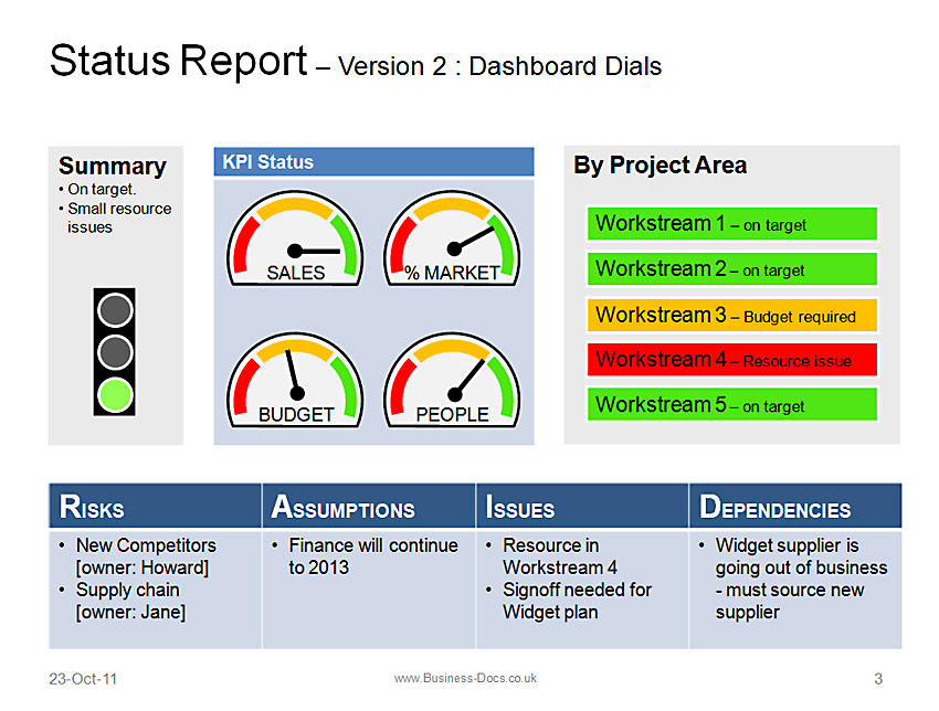
Communicating a large amount of information on any project into a simple, easier to read and digest format is always something of a challenge. The trick is to focus on the key areas and “zoom” in on them.
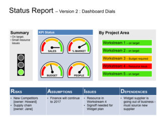
We have read a fair bit of conventional wisdom which states that creating the ideal dashboard template should be kept simple (we agree) and that attempting to replicate the most traditional of dashboards in that of a car is to be avoided as it is not necessary. This struck a chord with us as we fundamentally disagreed – after all, cars display the most complex of information in a format which is universally accepted and which in spite of digital advances has remained largely the same using dials with redder bits akin to a RAG status.
So we started to build one and soon understood the reason behind conventional wisdom – making a car dashboard which is fully automated, pleasant on the eye and useful to those looking at it is really quite difficult! Being that difficult is our middle name (well it is documents but you get the gist) we would not take really quite difficult as an answer so persevered and finally late one night we had done it.
You can see our status template with dynamic dials here.
…in all of its 3-colour glory!
We are quite proud of it, but as ever, feedback is always welcome. As an added incentive, the first 5 people who can e-mail us with “How hard could it be” in the title will get a free version to give it a test drive.
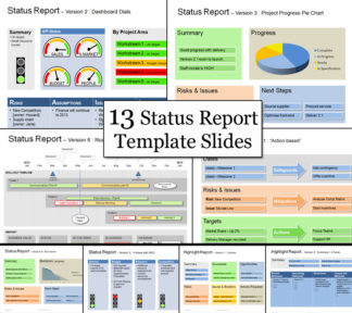
Our Status Templates
-

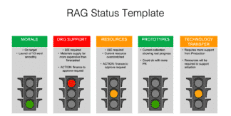
RAG Status Template PowerPoint
$ 23.99 Add to cart -

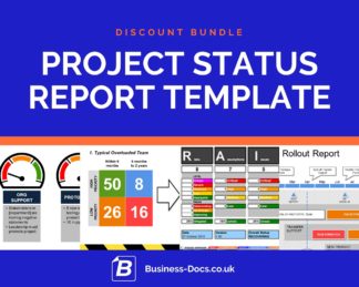
Project Status Report Template Discount Bundle (PPT & Excel)
$ 73.49 Add to cart -

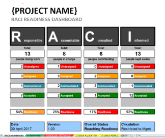
RACI Template & Dashboard for managing project responsibilities (Excel)
$ 16.78 Add to cart -

Supplier Selection Dashboard Template
$ 12.99 Add to cart -
Keynote Status Report Template (Mac Compatible)
$ 18.99 Add to cart -
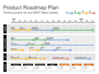
Keynote Roadmap Template with SWOT & PESTLE (Mac Compatible)
$ 14.98 Add to cart