 Find Presentation templates, help, articles for Marketing topics.
“All style and no substance” is something that we have all heard before; uttered by way of a critique, not implying but forthrightly stating that a product, idea or even a person looks the part but this hides an absence of anything to back it up.
In our time we have seen our fair share of this; C.V.’s that are too good to be true and interviews that go so well you cannot believe you’ve found the right candidate (you haven’t). Our particular bug bear is gloriously presented power points which go swish and woosh and fly in and out of focus at the right time. And tell you precisely nothing except that you are really good at powerpoint and animations.
But what of the other way around?
If style over substance is annoying (and it is) what of substance without style?
All modern thoughts in the business world revolve now around the concept of brand, not just the company you work for or the product you sell, but of you, an individual. What do you represent when you walk into a room or stand on stage or present to the board for the first time? All sets of eyes are on you, its your moment to show them (delete as appropriate) why you are worth hiring / not firing / giving a pay rise / about to give a pay rise / promotion etc.
Even at a more mundane level, the first time you are asked to send detailed information to a board member or senior manager is often in the format of an attached document. Which at the end of the day represents you.
So a company selling templates is going to recommend buying good templates?
Yes. But not always.
We have genuinely witnessed many average people promoted, having presented their average work in a brilliant way over brilliant people presenting their work in an average way. Right or wrong, its just what we’ve seen.
Consider the audience, the requirement and the message you are trying to get across.
1. Don’t over do it

If you have been asked for a no-frill 5 line overview to be sent on an e-mail, we would recommend you produced exactly that.
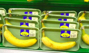
After all, sometimes less really is more; you wouldn’t over engineer packaging for a single banana now would you?
2. Be clear
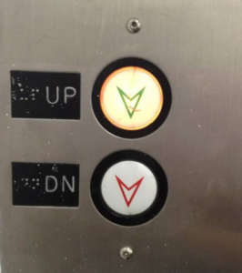
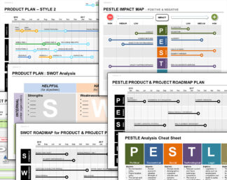
Use our templates, create your own, develop your unique style, use graphics and buttons or anything else you can think of.
BUT if they are there because they are pretty and don’t tell you anything, take them out. Anything that does not add information in an easy to comprehend way that makes immediate sense is a huge distraction will subtract hugely from the rest of your hard work.
3. Be Consistent
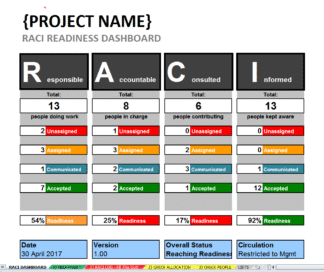
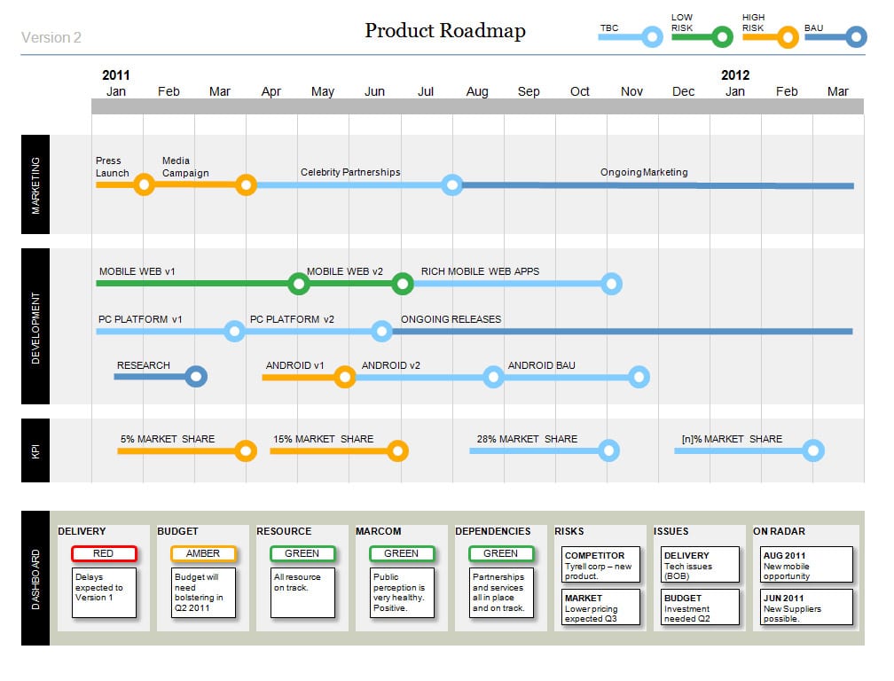
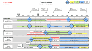
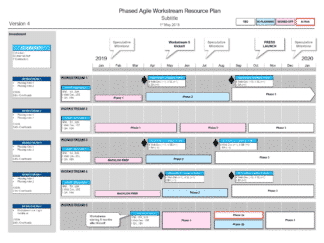
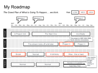
 Define what and how you report and show this in the same way with the same criteria each time.
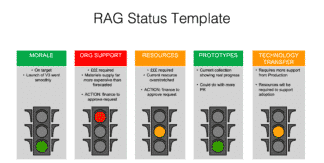
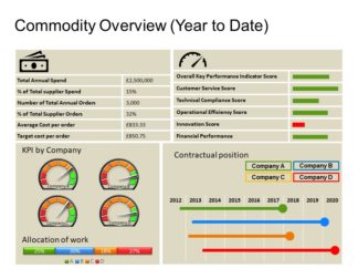
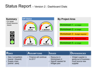
e.g. If you use Red Amber Green ratings on a dial and Amber is always 70% for instance, don’t have another report out there with a different dial and Green at 70%.
4. Take a step back and check it works
Sometimes we get too close to a project and struggle to convey information to those who do not know the ins and outs. Validate it with others to make sure that what you are trying to get across is actually what you are getting across.
It’s easy to get it wrong sometimes!